Kappy Arnold

Curious about almost everything.

Latest experiment

Experiment 002 · 2026 Plotted Honestly What would comparing your life to everyone else’s look like if we could actually see all the paths people take? Open

Experiments (updated weekly)

View archive

Selected Work

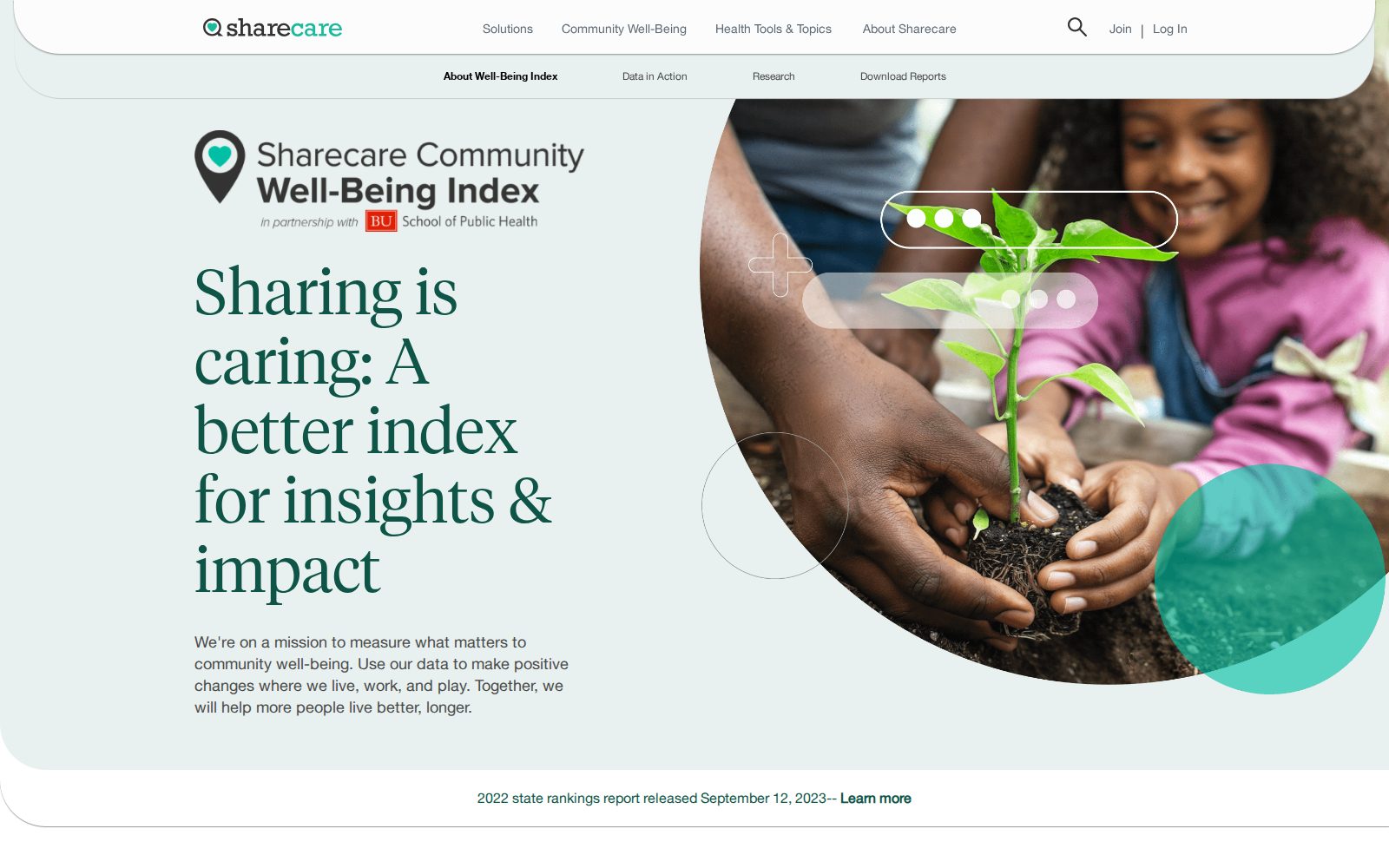
The Sharecare Community Well-Being Index website homepage
Community Well-Being Index Sharecare · 2020–2022 A research index, repositioned as a product.
2020–2021

Figures for Sandro Galea’s bookThe Contagion Next Time

Identity for his newsletterThe Healthiest Goldfish

A graffiti-covered passenger car with BOSTON lettered along the top Photography
Experiment 002

Plotted Honestly · 2026

See the lines
The question

What would comparing your life to everyone else’s look like if we could actually see all the paths people take?

What I made

An interactive visualization that plots different paths people take through life rather than presenting one timeline as the timeline.

Process

I started with the familiar feeling of being “behind” and wanted to see whether that idea looked different when visualized. The challenge was showing how varied people’s paths actually are without making the visualization meaningless.

Experiment 001

Boston Weather Beacon · 2026

The question

There’s a 75-year-old light above Boston that tells you the weather. Why do I still need to look at my phone to know what it’s saying?

What I made

A live digital version of Boston’s Weather Beacon that translates the forecast into the beacon’s red, blue, steady and flashing language.

Process

I started with the original beacon rules, then mapped live weather conditions to its four states. I kept the interface deliberately sparse so the light itself does most of the communicating.

The preview cycles through all four states. The live version shows today’s.

Before the series

The Plain Version · 2026

The question

What is this actually trying to say?

What I made

A small collection of complicated language reduced to its clearest version. Each example puts the original beside what remains when I strip away everything that isn’t helping the meaning.

Why I made it

I ask some version of this question constantly. About writing, data, interfaces, ideas, almost anything. The Plain Version was the first time I turned that instinct into something of its own.

Before the series

In Service Of · 2026

The question

What if every service business were held to the standard of a five-star hotel?

What I made

A working library of hospitality principles, translated for industries that serve people, from legal and healthcare to finance, retail and technology.

Why I made it

I was interested in the tiny things great hotels do that make service feel unusually thoughtful, and whether those same principles could work somewhere completely different.

This project is password-protected. Curious? Email me.

Selected work · Sharecare

Community Well-Being Index · 2020–2022

The question

How do you make population-health research useful to people who don’t work in population health?

What I did

When Sharecare partnered with Boston University School of Public Health to expand the Community Well-Being Index beyond individual well-being to the conditions shaping community health, the Index needed a new way to explain its value. As project manager and content strategist, I wrote the first reports in the new format, led the Data in Action series that turned roughly 500,000 annual survey responses into stories for media, policymakers, and partners, and designed the state scorecards and partner site that repositioned the Index from a research tool into an offering states and employers could buy.

Links
The Sharecare Community Well-Being Index website homepage
Selected work · Boston University

The 3-D Commission · 2020–2021

The question

How should data on the social determinants of health shape the decisions people actually make?

What I did

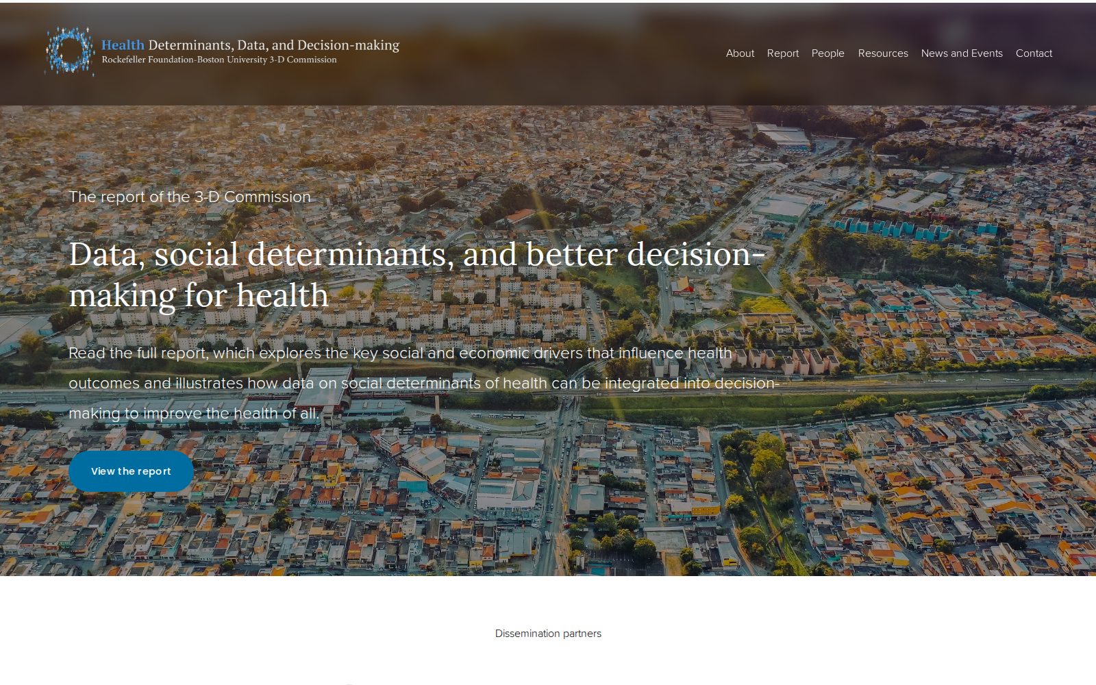
Convened by Boston University School of Public Health with support from the Rockefeller Foundation, the 3-D Commission brought researchers and practitioners from around the world to one question: how data on the social determinants of health should shape decision-making. As a Dean's Office Fellow, I led the commission's digital communications, shaping its website, social presence, and the visual translation of its research, including the figures for its final report, Data, social determinants, and better decision-making for health.

Links
The 3-D Commission website, featuring its report on data, social determinants, and decision-making for health